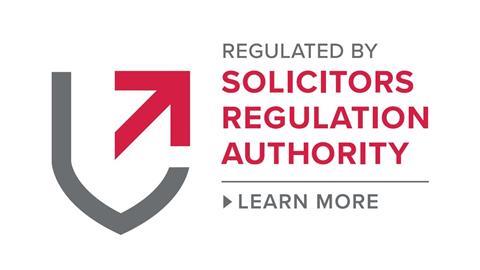
Obiter admits being tad nonplussed by the SRA’s new digital badge, released to a moderate fanfare earlier this month.
The badge is available for firms to download and include on their website (this will become mandatory from next spring) and allows users to click through to information about the firm proving who they are. This function will be available only to regulated firms and businesses.
As a liner of defence against fraudsters, we see the merit of the idea. But what of the badge itself? Obiter’s untrained eye sees a broken shield merged with the opening credits of Dad’s Army, as well as the intensely annoying lack of a definite article before ‘Solicitors Regulation Authority’.
So we asked the experts: specifically marketing specialist Rare Design, based in west London. And it turns out there is more to the logo than we first imagined. Director Andrew Piper explains: ‘The new mark demonstrates greater authority and strength. It deeply communicates intent through use of the arrow, within a context of security and protection in the overall shield form.
‘Use of BOLD UPPERCASE typography reflects the strength of the logo device and red and grey colours signal stability and authority.’ So now we know.














8 Readers' comments